Posted by SarahA
Sketches can be a scrapbooker's best tool when it comes to getting layouts done when you're short on time. They can give your creativity a jump start and encourage you to try design ideas you may not have thought of before.
Sometimes though, searching for just the right sketch that speaks to you can be difficult. Sometimes you may find a sketch you love, but you don't want to use it more than once so you don't have layouts that all look the same in your albums.
I'd like to show you how you can stretch just one sketch into four very different layouts.
I started with this sketch from PageMaps that I really liked for several reasons. I really liked the 3 patterned paper pieces, the stitching and the little cluster in the bottom corner.

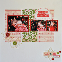
Holiday Greetings
The first layout I did was a pretty close to exact interpretation of the sketch. I kept all the design elements in place. The main difference is changing the presents out for snowflakes on my layout. I even used the same photo dimensions given on the sketch. I really liked the October Afternoon Holiday Style line- it went perfectly with my photos and were bright, happy Christmas colors.
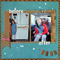
Before & After
A few weeks ago I was talking with a friend and she mentioned looking for a sketch, but not having the right size photos listed. When using a sketch, there are no rules! On this layout, I followed the sketch pretty closely for the design, but used 2 4x6 photos instead of the 3 smaller photos on the sketch.
I also placed the title differently and added some journaling around the edges. You can see the basic sketch in my layout, but I've made a few changes to suit the photos I had. The My Mind's Eye Kraft Fun Day line has a lot of great, trendy designs. I especially liked the number paper for this layout about the first day of school. I used my white pen to give the kraft pieces a little dimension.
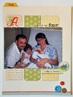
Family of Four
I've really been into doing 8.5x11" pages lately. I am able to easily include them in my D-ring albums amongst my 12x12 layouts. Actually, the first 8.5x11 I tried was earlier this year using a sketch! I would say the majority of sketches are 12x12, but that doesn't mean you can't use them to create a different sized page.
You can always scale it down if you're doing an 8x8, a mini album, or an 8.5x11 like I did here. I shrunk the size of the paper pieces and used one large photo. I kept the title placement, cluster at the bottom of the page and at the bottom of the right-hand strip of paper.
The Sidewalks line from October Afternoon was just perfect for this photo of a newborn baby and happy family! You can't beat October Afternoon's vintage whimisical style when scrapping a baby!
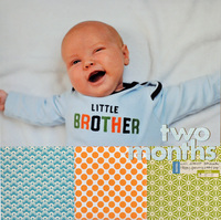
Two Months
This layout deviates the most from the sketch, but you can still see how they are related. The 3 patterned paper pieces were my favorite part of the sketch- I really love the uneven number design principle! I had an 8x12 photo I had been wanting to scrap, and decided now was the time!
I cut three 4x4 squares and used zig-zag stitching to adhere them to the bottom of the layout. I placed the photo at the top. The sketch had stitching around the title, so I stitched my title alphas to the layout. A few stickers under the title reflect the "date" clusters from the sketch.
So, you can see that there were elements of the sketch that I used in this layout, yet the layout doesn't resemble the sketch much at all.
You can see how if you have one sketch you really love, you can make several layouts from it without feeling like you'll have four of the same layout in your album. Just by using different size or number of photos, rotating the sketch, or by just pulling several elements from the sketch that you really like will let you stretch your favorite sketches further! Even when they're all lined up together, you still see 4 distinct layouts.
Products used in this reveal:


Sometimes though, searching for just the right sketch that speaks to you can be difficult. Sometimes you may find a sketch you love, but you don't want to use it more than once so you don't have layouts that all look the same in your albums.
I'd like to show you how you can stretch just one sketch into four very different layouts.
I started with this sketch from PageMaps that I really liked for several reasons. I really liked the 3 patterned paper pieces, the stitching and the little cluster in the bottom corner.

Holiday Greetings
The first layout I did was a pretty close to exact interpretation of the sketch. I kept all the design elements in place. The main difference is changing the presents out for snowflakes on my layout. I even used the same photo dimensions given on the sketch. I really liked the October Afternoon Holiday Style line- it went perfectly with my photos and were bright, happy Christmas colors.
Before & After
A few weeks ago I was talking with a friend and she mentioned looking for a sketch, but not having the right size photos listed. When using a sketch, there are no rules! On this layout, I followed the sketch pretty closely for the design, but used 2 4x6 photos instead of the 3 smaller photos on the sketch.
I also placed the title differently and added some journaling around the edges. You can see the basic sketch in my layout, but I've made a few changes to suit the photos I had. The My Mind's Eye Kraft Fun Day line has a lot of great, trendy designs. I especially liked the number paper for this layout about the first day of school. I used my white pen to give the kraft pieces a little dimension.
Family of Four
I've really been into doing 8.5x11" pages lately. I am able to easily include them in my D-ring albums amongst my 12x12 layouts. Actually, the first 8.5x11 I tried was earlier this year using a sketch! I would say the majority of sketches are 12x12, but that doesn't mean you can't use them to create a different sized page.
You can always scale it down if you're doing an 8x8, a mini album, or an 8.5x11 like I did here. I shrunk the size of the paper pieces and used one large photo. I kept the title placement, cluster at the bottom of the page and at the bottom of the right-hand strip of paper.
The Sidewalks line from October Afternoon was just perfect for this photo of a newborn baby and happy family! You can't beat October Afternoon's vintage whimisical style when scrapping a baby!
Two Months
This layout deviates the most from the sketch, but you can still see how they are related. The 3 patterned paper pieces were my favorite part of the sketch- I really love the uneven number design principle! I had an 8x12 photo I had been wanting to scrap, and decided now was the time!
I cut three 4x4 squares and used zig-zag stitching to adhere them to the bottom of the layout. I placed the photo at the top. The sketch had stitching around the title, so I stitched my title alphas to the layout. A few stickers under the title reflect the "date" clusters from the sketch.
So, you can see that there were elements of the sketch that I used in this layout, yet the layout doesn't resemble the sketch much at all.
You can see how if you have one sketch you really love, you can make several layouts from it without feeling like you'll have four of the same layout in your album. Just by using different size or number of photos, rotating the sketch, or by just pulling several elements from the sketch that you really like will let you stretch your favorite sketches further! Even when they're all lined up together, you still see 4 distinct layouts.


Products used in this reveal:


4 comments:
Wonderful examples, Sarah!
We're so happy you liked them, Sandy!
am gonna have to try this and see what I do! Never thought to do it 4 ways!
Katherine - We'd LOVE to see how you use this idea. Be sure to post your layouts in the ACherryOnTop.com gallery!
Post a Comment