Showing posts with label american crafts thickers. Show all posts

Wednesday, February 18, 2015

February Guest Designer Craft Challenges In Full Swing!


Just in case you missed our announcement earlier this month, we brought back our monthly Guest Designers!  

Krystle is an incredibly creative scrapbooker of over 17 years and we're thrilled to have her as our February Guest Designer!

You can read more about her by visiting our Featured Guests area.  Also, be sure to take a peek at her gallery.  It's sure to inspire! 


Krystle has been busy creating exciting challenges for our community members.  Here are links all of the fun:

Challenge #1: Double Page Layout Mirror Challenge

Challenge #2: Limited Color Layout Challenge

Challenge #3:  Using Flowers on a Masculine Layout Challenge

Challenge #4:  New & Old Challenge

Challenge #5:  Create a Multi-Fold Card Challenge

One participant from each paper craft challenge will be selected to WIN a $5 A Cherry On Top Gift Certificate!  So, get in on the creative fun during Krystle's Guest Designer month!

Happy Crafting!

guest designer call
Click here to find out how to submit


Join us on Facebook See us on YouTube    Follow us on Twitter


Tuesday, February 3, 2015

Help Us Welcome This Month's Guest Designer!

It's been too long since we've been able to announce a NEW GUEST DESIGNER at ACherryOnTop.com.  So, needless to say - we're pretty excited to welcome Krystle as our February 2015 Guest!


Screenname: Krystle


Favorite Color: Green


'I mostly create': Layouts


Guilty Pleasure: Watching TV. Lots of TV!


Bio:  I am a long-time scrapper,  having begun to scrap in 1998.  During the past 4 years, however, my hobby has become an obsession!  For me, scrapbooking is therapeutic and I enjoy preserving memories in such a beautiful way.


My wonderful husband does not understand my hobby, but he is a good sport about it!  I live with my husband in Albuquerque, NM, and we are expecting a baby boy in April!


Krystle worked with products from Authentique, Petaloo, American Crafts and Petaloo.  Here are a couple of her projects:

Layout: 'Love Pop'


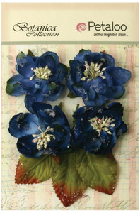
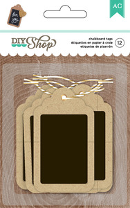
Krystle used DIY Shop 2 Chalkboard Tags, Authentique's 'Superior Paper and gorgeous flowers from Petaloo: 

petaloo royal blue sugared blooms botanica diy shop 2 kraft chalkboard tags american craftssuperior paper authentique paper  


Layout: 'Live Life at Full Speed:

click image to enlarge

Click here to view more projects from Krystle and be sure to visit our Message Board for her exciting CHALLENGES during the month of February at ACherryOnTop.com - 


Click here to find out how to submit

Wednesday, December 7, 2011

Design Principles: Proportion


Posted by megamay (Megan):


Last month I discussed the first of five design principles - balance. This month I am moving on to proportion. Proportion isn't as easy to explain as balance. Who am I kidding? I have trouble spelling it! 


However, it is definitely worth taking the time to learn about because it is a very important aspect of design.


Here are a few principles of proportion to keep in mind:


1. usually the human body is used as a scale - especially in architecture and paintings. Alterations to the scale with respect to the human body can be used to achieve interesting results. Buildings with a larger than average scale can make one feel small and insignificant. In fact, many churches were designed with that effect in mind. Alternatively, a chair shaped like a oversized hand can be used to make a statement and be outrageous.


2. Large proportions make something eye catching or impressive. - Again the example of a church comes to mind. Gothic style cathedrals used large proportions to create a sense of wonder. Large bold prints on a pillow, or quilt similarly draw the eye when contrasted with a more simply colored sofa.


3. Large patterns can overwhelm small objects - A large print on a small pillow can draw the eye, but the same print on a baby's dress might be overwhelming.


So, how does this apply to scrapbooking? 


The print example relates to scrapbooking because the choice between large and small prints is important. Probably the most important proportion rule to keep in mind in scrapbooking is the golden ratio, the rule of thirds if you will. 


This can be used for the ratio of colors, the placement of photos paper and embellishments, and even the composition of your photos. 


I found this diagram of good and bad proportion and think it's just perfect! it's from Blue Moon's online art class:


The first example of good proportion is pretty much the rule of thirds. 


Halves and quarters are bad, thirds are good.


Here are some scrapbook layout examples. For this page I used a sketch, but notice that the main interest is situated not on the horizontal half point of the page, but about a third of the way up. 


Also, about two-thirds of the color is pink, and the other third is white/black/blue. (disregarding the kraft) 


Finally, notice the scale, the photos are small, so the details are small. The larger letters in 'LOOK' really stand out because they are larger than everything else.


Here I went the opposite way. The photo is LARGE! The tiny pins and spool of thread would have looked silly with a photo this large, so I went with larger letters, large bold circle accents and even a larger scaled polka dot print. 


Also, the photo takes up about a third of the page.  The title/journaling block takes up about a third of the non photo block.


Finally, on this page, the center of the photo block is situated just above where a line would be if the page was divided into thirds.  The smaller polka dot print works here with the smaller scale of the photo. Compare this polka dot print to the one above. The large flowers, however, are a bit out of place and therefore serve to add some interest and draw attention.


Supplies used in this reveal: