Thursday, July 28, 2011

Creating With Amy Teets Designs


Posted by Smiley-Scrap8 (Ronny):


This week the Digi CT is very excited to present our designs using the fantastic kits by Amy Teets. 


Amy's designs are like no other, they are so soft and unique. They are perfect for all events, the team shows of family events, the kids and even travel. 


And lets not forget hybrid projects; Amy designs lend themselves perfectly to hybrid scrapping. So sit back and enjoy the show.

Wednesday, July 27, 2011

How To Make An Altered Birdhouse


Posted by ChrissyTina (Christina):


The latest trend in altered items has caught me by surprise!  Birdhouses!  I remember when I first saw these, I honestly wasn't that interested in them.  And then I gave them a second look.  All of the sudden I just had to do one!  And then one turned into two and two into three until I had four of them done- one for each of my kids.


Now when it comes to altering objects, I tend to use a lot of paints, stains, and other such items because I have THE HARDEST time covering things in paper.  The paper always ends up too big or to small or crooked.  Absolute madness!  


It's enough to drive anyone wonky!  And then the idea occurred to me.  STAIN!  I love wood grain and how with stains you can see the beautiful patterns in the wood.  Why not just use that as an embellishment in itself?  So I did.


This first house is my "Steampunk'd" house.  I used Tattered Angels Glimmer Glaze in "Cowboy" and "Chianti".  The main body of the house is done using "Cowboy".  The trims and between the slats of the roof is stained with "Chianti".


I chose these two stains knowing that I had planned on using Graphic 45's "Steampunk Debutante".  The deep rich Chianti and the rustic Cowboy complimented these papers perfectly without being too harsh. 


I wanted to soften the typical steampunk look so I chose embellishments that were feminine and full of detail.  I used gears as more of a background theme.


The easiest way to tackle one of these types of projects is to work in layers.  Knowing what you want your end result to be is also very helpful.  My first layer was the stain.  While that was drying, I picked out the images from the papers that I wanted to use and fussy cut them.  I usually always pop dot things from the surface because it breathes a kind of life and interest into the piece.


So my second layer were the border strips I punched for the trim of the roof, the ball chains, and any images that were not being pop dotted up.  On the third layer were my final touches- things that were pop dotted. 
If you look closely at some of the images and the trim on the front of the house, you will see crackling.  I used Ranger's Crackle Accents to age these pieces and give them a more industrial yet vintage look.


In keeping with the soften steampunked theme, I added a Tim Holtz game spinner to the butterfly.  As a final touch, I lightly sprayed the whole house with Tattered Angels Glimmer Mist in "Iridescent Gold".  Nothing beats a subtle sparkle!


Anyone who knows me knows that I tend to be a bit detail oriented.  So naturally, I did the back of the house too.  Because it is the back, I kept it pretty simple and not very indepth.  I cut out an image that just captivated me and stuck on there...with pop dots of course!


If you keep in mind to take things one layer at a time and apply this approach, then any altered item will be easy to do.  In each of the following pieces, I worked in layers and the end result is always kept in focus.


On my second birdhouse, I used Graphic 45's "Once Upon A Springtime" and embellishments from Tim Holtz and Bo Bunny.  The paint is just white gesso and Adirondack's "Lettuce Green" paint dabber.


Click for more views
 
 
The next birdhouse is made using Graphic 45's "Magic of Oz".  This one used A LOT more fussy cutting and more layers.  I wanted to convey the scene where Dorothy and friends are crossing the poppy field to the Emerald City.  Each side of the house shows a particular scene.  I used Making Memories acrylic paint in "Pine" and Glitter Paint in "Seafoam".  Embellishments are Tim Holtz


Click for detailed view


The final birdhouse uses Graphic 45's "Le Cirque" collection.  I wanted this house to feel and look like the Big Top!


I hope you enjoyed looking at these birdhouses and feel inspired to do some of your own.  Just remember-  think in terms of layers and keep your end result in focus.  You won't believe me when I tell you that it took me about 2 to 2.5 hours to do each house.  That's it!  Have fun!  Get messy!  And stay creative!
 
Thanks to ACOT for letting play with these products!

Monday, July 25, 2011

Back From CHA Summer 2011 - Booth Tour With Jared Of Fancy Pants Designs


We had a wonderful time with the Fancy Pants Team!  Thanks Jared for showing us around.  New products will begin arriving in the shoppe soon.  Be sure to check out all things Fancy Pants at ACherryOnTop.com!

Thursday, July 14, 2011

Digital Scrapbooking With Kollage By Kay -

Posted by Janell:

Our inspiration this week comes to you by the lovely and talented Kay Eflin, creator of "Kollage by Kay".  A Collage ~ is an artistic composition of materials and objects pasted over a surface, from French word for gluing.  At Kollage by Kay, Kay can help your scrapping be both artistic and memorable.  If you like layering and lots of elements, Kollage by Kay are the designs for you to preserve those precious memories


Even with a newborn, Ronny found time to scrap this beautiful layout using some fabulous pictures from her family's Fourth of July Celebration.  This next layout is one of our FAVORITES featuring Ronny's precious little one:


Angie said, "When planning on featuring Kollage By Kay I saw her 4th of July Quick Pages and coordinating Fourth of July kit. I knew it would be perfect for our 4th pics! I used her Quick page as a starting point and then I built on top of it! So, don't be afraid to use a Quick-page, they are super easy and can give you a great headstart!"


Janell said "It was really fun to use Kay's altered journal pages for my visit to the Statue of Liberty. I was able to blend in my own photo with her watercolor pages to make a custom looking paper that was just what I was looking for!"


Laura adds, "Kollage by Kay has a gorgeous line of Altered Art Journal Papers that are wonderful for everything from backgrounds to journal blocks."

This next layout by Laura makes me want to go swim with that Polar Bear!  Laura your layout is "hot" and we love the animal stickers and awesome layering.


Laura is a fan of Kollage by Kay and admits, "Kay has been one of my favorite designers for a long time, now, because of her unique embellishments and her wide variety of kits."


Janell exclaims, "Spotlighting the creations of "Kollage by Kay" this week. I love this cluster frame that she created, it's rich and beautiful and easy to make a great layout especially when combined with her rich autumn paper pack." 


Janell created this layout using Kay's Altered Chevy Truck Journal papers.
 

You can view the wonderful products by Kollage by Kay used in this reveal here:


Wednesday, July 13, 2011

Paper Crafting With The Oxford Collection By Basic Grey

Posted by ScrapGoo (Jess):

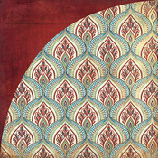
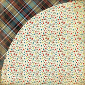
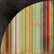
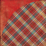
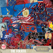
When it comes to patterns Basic Grey is top of the class! Their new collection, 
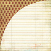
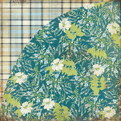
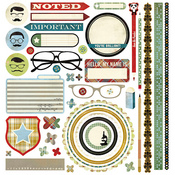
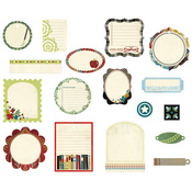
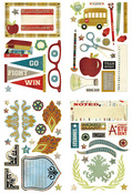
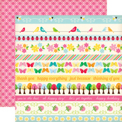
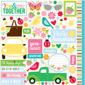
Oxford, is straight from the pages of a college yearbook with plaids and sophisticated yet masculine prints that have a touch of yesteryear combined with typical Basic Grey whimsy.  Naturally, the collection is full of fun embellishments made of everything from chipboard to brads to stickers and they will definitely make you smile!  

How can you not love the old school glasses and all the great academic icons?  This collection definitely has a lot going on!  There are patterns galore and a lot of different colors.  It can be intimidating to work with all that but not if you remember that you don't need to use *everything* on one page.  Simple is good and a little goes a long way.  

Take a look at what I created with Oxford-hopefully I make the grade!

The Apple of His Eye


I decided to pick out just a few colors for this layout.  The reds and blacks worked well with my photo and allowed me to not be overwhelmed by all the pattern options.  My title was inspired by the cute apple chipboard!  I tried to keep the design clean and easy on the eye by matting most of the main area with the cream lined paper.  It draws the eye in and unifies the rest of the elements.

Sleep Cheeks


I went in the opposite color direction with this scrapbooking page.  Again, I drew the cues from my photos and chose blues for this layout.  A PageMaps sketch made this page come together quickly.  Although the prints of Oxford are sophisticated they can still be great for the little guys too!  I used the chipboard stars to bring some youth to this page. 

Smart: It's in the Genes


This is Oxford in all its glory!  I used an old college photo of my dad here.  He is a smart cookie!  And I have to thank him for passing on his smarts to yours truly.  ;-)  I really fell in love with the chipboard elements in this collection; the science stuff, books, writing instruments, and of course the glasses!  (I can assure you that boys DO make passes at girls who wear glasses!) I just layered the crud out of this page- fun!

Oxford Congrats


This cute dotted paper is one of the more fun papers in this line and probably my favorite, of course I needed to make a little card with it!  This would be a great graduation card but I think it could be given to a guy for nearly any important achievement.  I used several layers of journaling bits and chipboard here to build up a mat for the sentiment.  And some natural twine is a great masculine embellishment!

You Da Man


Okay, okay... I could NOT let this article end without using these AWESOME moustache stickers!  Moustache images are pretty trendy right now and these make me giggle!  Again, around here I can never have too many guy cards so this will definitely come in handy.  I think this simple card will bring a smile to the receiver. 

So, you can see how many different sides this collection has.  It is both serious and silly.  I hope you take a trip to Oxford like I have... only THIS Oxford won't involve pop quizzes or crotchety professors! :-P

I used the following products on these projects:


Tuesday, July 12, 2011

Paper Crafting With Echo Park Paper's Country Drive

Posted by SarahA (Sarah):


When I saw the sneak peeks from Echo Park of the Country Drive line, I was SO excited! I was waiting and waiting and impatiently waiting some more for this to show up in the shoppe. I knew these colors and the patterns would be just perfect for some sort of wall hanging I wanted to make for my daughter's room. 

You should have seen me when I got my order home! I had it all spread out around me on the living room floor, smiling like a big dork. Or maybe just like a happy scrapbooker. :)

Printer's Tray Wall Hanging

The first project I did was the wall hanging I had planned on making. I made 6 different 4x6 pieces and fit them in each slot of a printer's tray. This was really a fun project to work on because it was all about embellishment and details. I made good use of the papers, journaling cards and stickers from the sticker sheet on this one.  

The Doodlebug Nifty Notions buttons matched this line perfectly, so I used a lot of those, too.  The multitude of cute patterns and stickers in this line made so many possibilities with this project- flowers, bees, butterflies, hearts and ladybugs galore!  I also loved the little phrase stickers on the alpha and sticker sheets.

Each of these blocks could easily be adapted to be a greeting card or a page embellishment. Clicking on the photo will take you to my gallery where there is a close up of each block.


Hey Little Guy...

I've really been liking the 8.5"x11" size lately just for something different. I find it's a great way to showcase a single photo, just like I did here where I really wanted the photo to be the main focus. I used the bee strip from the strips paper as a divider, then used one of the cute cards for my journaling. I tried to keep the page "boy-ish" by using scrapbooking papers with neutral patterns in yellow, blue and orange.  I can't get enough of the great Doodlebug buttons, so I had to add some of those, too.

I've Been Waiting

I couldn't have this line and not do a page on the joys of country living! These colors really go well with any background, especially a neutral kraft. I layered several strips and put my photos on top. Some of the small alphas on the alpha sheet worked great for my long title and some of the smaller stickers were great embellishments.

A few other notes about this line: I really like the matching solid papers. They are double sided and have a slight cross hatch pattern and are perfect to use in place of cardstock! I also think the journaling cards are SUPER cute! I love them. I actually love them so much, I got 3 sheets! Don't you think they'd be perfect as a base for little cards?


Products used in this reveal: