Thursday, March 31, 2011

Scrapbooking With The Botanical Collection By Prima

Posted by JulesinParadise (Jules)

It is Spring and a girl's fancy turns to....why pretty papers and embellishments, what else?  And I found my heart's desire with Prima's Botanical line.  The papers are soft and lovely and so conducive to scrapping almost anything.

This company, which is known for its amazing flowers, has out done itself with this product line.  The rub ons go on smoothly, the flowers enhance the papers and the chipboard shapes and paper cut outs are perfection. 

I had such a wonderful time scrapping a variety of photos with these and still have many more to do.  I am definately reordering this line!  I hope you are not tired of seeing my photos of our Med. cruise.  I could not help myself.  These papers were perfect for our lunch in the Plaka in Athens, our arrival in Salerno, Italy and our day trip up the Amalfi Coast.

The photos on the layouts of Salerno and Amalfi were printed onto canvas paper and enhanced with pearlescent water color paints and painted on Glimmer Mists.  I first sharpen the photo in my Picasa program, then print.  I allow the canvas paper to dry over night, apply the paints and mists with a small tipped paint brush, allow those to dry and spray with an acrylic sealer.  The photos turn out looking like a painting with depth and texture.
 

Last January, our friend from New Zealand, Clare, came to visit the US and spent two weeks with Janet M, Pam B and me here in Paradise.  We spent four days together, thanks to Clare, on Captiva Island.  The tales are many and the laughs continue to this day.  During a morning walk on the beach, I shot this picture of Pam.  She had no idea I snapped this.  I love this candid of her.  I love that she is My Friend.

On one of our last days, Janet M, her husband, Bob, my hubby, Clare and I attended a showing at the Chihuly Glass Museum and, afterwards, had drinks on the veranda of the historic Vinoy hotel in St. Pete, Florida.  It was a beautiful day and thank you Prima for creating the perfect papers for the layout.

I have often thought that many of the papers carried in the ACOT store would be lovely to paper a room or turn into wearable art...so I did.  I scanned the paper, printed it onto canvas paper just as I did for the Amalfi Coast photo and enhanced the color a bit with Smooch.  What this did was add the appearance of texture to the print.

I scanned this and printed it onto June Tailor iron on fabric.  I cut that into squares and placed them on my tee shirt.  I used a permanent fabric glue to adhere the lace trim (Webster's Pages).  The Prima flower is attached with magnets, one glued to the back of the flower and a second one placed inside the tee shirt directly behind the flower.  A woman at a store had one attached to a blouse this way and I've borrowed her idea.  This way, the lovely silk flower can be removed for washing the tee (inside out, of course, on delicate hung to dry).

Thank you, Prima, for making my heart sing!
-------------------------------------------------------------

Jules is a retired English teacher originally from St. Louis, MO.  Besides paper crafting, she enjoys traveling with her best friend/husband Gene, kayaking and teaching scrapbooking classes locally and nationally.
Wednesday, March 30, 2011

Scrapbooking With Sweetly Smitten By Sassafras Lass

Posted by megamay (Megan)

This month I was lucky enough to work with Sassafras Lass' new 'Sweetly Smitten' line. The colors in this line are just divine! I love the bright, but not garish, oranges and yellows mixed with the pinks and a pop of teal. 

For my first page, I used a PageMaps sketch, and a photo of my daughter with blue cotton candy. The blue cotton candy plays off of the blues in the paper. I used my cricut to cut the kraft paper into the fancy bracket shape, then since I didn't want to waste all of that background paper, I cut a half inch smaller version of the same shape from the center of the background paper, so I could save it and re-use it.


With the paper that I saved from the page above, I created the next page. I cut the curved parts from three sides, and used them throughout the layout, and used the remaining center and one curved part as the main part of the page.


For this page, I just created a simple grid pattern. I didn't want it to be too busy, so I used the same color pallet throughout.


Finally, for this page, I used a sketch from Pencil Lines, and combined the Sweetly Smitten papers with a few pops of an older Sassafras Lass Line - Nerdy Bird.


-------------------------------------------------------
Megamay (aka: Megan) resides in Pennsylvania with her husband and daughter.  Megan has been scrapbooking for over 6 years and loves experimenting with her art.


Tuesday, March 29, 2011

How To Use Glimmer Glaze By Tattered Angels


Posted by bluejeans7

Now,  I know we have all heard of Glimmer Mist from Tattered Angels, but did you know about their Glimmer Glaze? I know Glimmer Glaze isn't new but for some reason I missed it when it first came out, so I decided to try it for my CT reveal. 

I have to admit that I was a little scared to try something totally new to me for a reveal, but I was also excited.  Just ask Pam, I bugged and texted her a lot.  LOL!  Sorry Pam!  Glimmer Glazes work on so many different surfaces.  You can use them on paper, wood, metal, glass and more!

I Love Being Your Mom:  I started this layout by spraying a sheet of white cardstock with the Chalkboard Teal High Heel and Decadence sprays.  I embossed some metal sheets and then painted them with the Midnight Rendezvous, Emerald Cove and Cowboy Glimmer Glazes.  

I added my title, some doodling around the edges and this layout was finished.  I can't believe that I created a layout with NO pattern paper!  LOL!!

 
Picture Perfect:  Once again I started with a white cardstock.  This time I sprayed it with the Chalkboard Polka Dot Pink, Decadence, Sprout and Firefly.  Then I used a couple sheets of patterned paper from the Bo Bunny Petal Pushers line.  I embossed another sheet of metal and then painted it with the Chianti Glimmer Glaze.  

For embellishments I used some Zva Creative pearls and Prima flowers.  I sprayed one flower with the Chalkboard Firefly.  The other three flowers were painted with the Wicked and Chianti Glimmer Glazes.  Then I added a little of the Pewter Glimmer Glaze for my center.

 
Forever In My Heart:  On my last layout, I used papers from the Basic Grey Lime Rickey line.  I punched and embossed a dozen hearts.  Then I painted half the hearts with the Chianti Glimmer Glaze and the other half with the Midnight Rendezvous Glimmmer Glaze.  I love how these hearts turned out!

 
Altered Boxes:  After making my layouts I decided I wanted to try altering a couple of boxes, one is a tin box and the other is wood.  Glimmer Glaze works great on both metal and wood.  I first painted the tin box with some white acrylic paint to cover the design.  After the paint dried I brushed on a layer of the Sugar Can Glimmer Glaze.  

Then I used a fan brush to add a thin layer of the Cowboy Glimmer Glaze and then sprayed it lightly with the Chalkboard Sprout spray.  On the lid I place some Mark Richards mosaic sticker tiles and a Prima flower.  For the wood box I started with a coat of Cowboy Glimmer Glaze, then added a heavy coat of Sugar Can Glimmer Glaze.  

After that dried, I went in with a fan paintbrush and added highlights of the Chianti Glimmer Glaze.  I also brushed the glass with the Chianti and then metal hinges and clasp with the Sugar Cane.  Some Zva Creative pearls and Prima flowers finish this box.

after 

-----------------------------------------------------------

Angela resides in Kansas with her husband and two children.  Her love of photography naturally drew her to scrapbooking.  Angela's favorite scrapbook manufacturers include Basic Grey, Prima and My Mind's Eye.

Thursday, March 24, 2011

Scrapbooking The World With Our International Creative Team


Posted by milmomma (Brittney):

"Everywhere we go-o - Pe-ople want to know-o - Who we a-are - And where we come from."

Well when it comes to the Digital Creative Team we can say All around the world. From all over the States, Canada, Bermuda and even me way out here in South Korea. As a wise warthog once said, "Home is where the rump rest." 

As one that travels often, I am happy to share my travels of the different places. Well this week, not only did I share my home, but so did my team mates.
대한민국 also known as South Korea

This is where my life is right now. We each shared our thoughts about Korea. Its culture is so different and unique. It is a wonderful Asian country. 
Jennifer(SaraWithers) wrote "For the Digi CT reveal this week, we're going international! The members of the CT are from all over the world, so we thought we'd share some of those places with you! For this page, it's in honour of Brittany (milmomma) who is from South Korea!"

I shared "For this week's reveal we are focusing on how we are the international group. And for me, its my life, the giant adventure. The true story of my feelings of South Korea."

Sara(Keling) says, "What a fun challenge this week! We each decided to create a layout on each other's countries of residence. I've never been in South Korea, so I hit Google and found a tourism website that had some awesome desktop wallpapers - isn't this just gorgeous!!!"


Next if we travel across the wide Pacific we will reach Jennifer's home in Canada. Canada is known for inventing some pretty awesome things from IMAX, Hockey, The Snowmobile, and even is even a travel destination as Cassandra shows.

Cassandra shares, "Given the choice between Canada, Bermuda and South Korea, I chose Canada because that's the one country of the three I've actually been to. My Dad's cousins took me to Vancouver, BC when I was sixteen and I have such great memories of that vacation. So in honor of Jenn (sarahwhithers)here is a page about her country, and I even used a Canadian page kit she made! 

Sara(Keiling) shared, "Part of my family lived in Newfoundland before moving to New York. It wasn't a part of Canada then, but I thought it would be cool to do a page about the family for this week's multi-national challenge."


I created my page after another one of Canada's great inventions, Peanut Butter. I said, "With this weeks reveal being international places, homes, whatever you wanna call it. :) This one is for Jennifer up in the chilly Canada. I tried to figure out how Canada tied to us. Peanut butter is one of the best things that came from Canada, at least in my son's eyes."

And for Jennifer, this is her homeland. She shares, "For the Digi CT reveal this week, we're going international! The members of the CT are from all over the world, so we thought we'd share some of those places with you! For this page, it's in honour of me! I'm from Canada so I did a page on my home city, Winnipeg."


And last but certainly not least we have traveled across the cold and snowy mountains and deserve our rest and relaxation on the beaches of Bermuda. Our very lucky Sara(Keling) is living in paradise. We each share our thoughts and day dreams about Bermuda.

Sara(Keling) shared, "My homeland... These great photos I took just a couple of days ago on a GORGEOUS spring morning, on the dock just down the street from my house!"


Jennifer(Sarawhithers) says, "For this page, it's in honour of Sara (Keling) whose from Bermuda!"

I shared, "For me Bermuda would be a vacation. Some place warm, sunny and sandy. Sounds super nice right now in the 30 degree temps I'm in."


----------------------------------------------------------
Brittney currently resides in South Korea with her husband and two children.  She enjoys photography, graphic design and rock climbing in her spare time.  Brittney has been a member of the ACOT family since 2007.

Wednesday, March 23, 2011

Scrapbooking With Reflections By Prima


Posted by ScrapGoo:

Oh, Prima... how you do empty my wallet with your delicious blooms and drool-worthy papers!  I'm deliriously happy to part with my money when I'm getting some Prima goodies in return!  
The new Reflections collection is full of the same beautiful, nature inspired products that we have come to expect from Prima.  

The colors are simply gorgeous and the quality can't be beat.  *Everyone* has some Prima in their stash and I seriously think you'll need to add this line after you take a closer look with me!

From little resin flowers to giant silky blooms, paper, flocked rub-ons, hanging crystal charms, and more you are sure to find something (or everything!) that is a must-have.

I Do

This was the first layout I created from the Reflections collection and I knew I wanted it to be the "essence" of the line.  Heritage photos and Prima go together like peanut butter and jelly! This photo is of my maternal grandparents on their wedding day in 1938 and that dress and bonnet alone deserve some *respect*!  ;-)  

I inked and stitched a white paper doily to match the green on the papers and used the packaging from the flowers as my journaling spot because, really, who could throw away something so pretty??  One of the Prima crstals hangs from the chipboard frame and I inserted another small photo of my grandparents in the center. 

I also hung a Prima locket from the flower cluster at the bottom.  Don't ask me how long it took me to get itty bitty photos!


Before There Was You

Sometimes when I am overwhelmed by all the color choices within a paper line I like to narrow it down to just a few that complement each other and find photos to match.  It streamlines the options and once you've narrowed down the products I think the page comes together quickly.  

I chose the blue, green and brown color combo for this layout and used photos from a friend's wedding. The border was cut from one of the patterned papers and I stitched several free form lines around the edge.  My favorite element is the banner made from the chipboard squares...fun! I love that this layout is less old fashioned than the first one but still has the pretty elements of nature like the cut out butterflies and floral patterns. 

This is What Joy Looks Like

This was the last layout I did and I fell more in love with it as I completed it!  There is Glimmer Mist ALL over this page!  The kraft cardstock grounds the fussy cut paper in the center and adds a warm glow.  I really didn't have to add all that much to this page to get the details.  

My favorite detail, however, is the cut bird. I used another of the really cool flocked rub-ons up the left side and layered other elements on the right.  I adore the warm orange with the cool blue... this is one of my favorite color combinations for boy layouts.


Merci Card

Mmmm, Prima cards!  Yummy!  The primary mat on this card is another piece of packaging.  They are perfect for cards!  This card ended up being really thick and heavy because of the multiple layers of chipboard.  I find it better to give these types of cards in person rather than send them though the mail due to their delicacy and the excess postage. Prima makes it sooooo easy to pile on the pretty stuff! 


4 Square Card


After the product explosion on the previous card I wanted to show you how lovely Prima can be on a minimalist scale too.  I used more of the chipboard squares mounted on 2" x 2" squares of paper with a stitched border.  I simply added a couple of layered flowers in the four square center, double stitched around the kraft mat, and voila!  Pretty, simple, and FAST with Prima!

I will never stop *needing* more Prima.  I jumped on the Reflections line right away for its gorgeous jewel tones and versatility. I hope you've seen all the possibilities with this collection!  Now get some of your own!
---------------------------------------------------

ScrapGoo (aka: Jess) resides in Framingham, MA with her husband, one year old son and three spoiled cats.  Besides paper crafting, Jess enjoys entertaining friends, traveling and costume designing.

Monday, March 21, 2011

Scrapbooking With Animal Crackers By Imaginisce

Posted by JanetM

Animal Crackers by Imaginisce is a really great line to work with...the colors are outstanding, the paper line fun and the embellishments are the perfect touches. Finding pictures to use with this line is really easy and I still have more lined up to do with it.

A Cherry On Top, you really gave me a great line to create with this month, I enjoyed each and every layout I made with the Animal Cracker line!
I knew the line was going to work great with pictures we have from going to the Ringling Museum, but it carried over to dance pictures from my daughter and ones from her childhood that I had to scrap.

I had as much fun creating the layouts for this months reveal as I did the time we spent taking all the pictures this day-

  almost. Being with them is always fun but getting the memories scrapped is a perfect way to remember the great times together.  Almost!
 

The grandchildren all love going to the Ringling Museum when they come to Florida to visit us, snd we never lack for pictures and they are really willing to get pictures taken being silly.


Our youngest grandson Troy is such a cute and funny little boy and this picture captured his personality and the paper line was a great one to put some fun into the layout.


It was perfect paper and embellishments to get these fun pictures of my daughter Rebecca and some of the girls from her acro team scrapped.


This line was great to use on this picture of Rebecca that I've had for more years than I should admit to.  It was fun to get the memory scrapped now for her to have.


The grandchildren having some fun at the playground by the beach here in Florida.


These pictures were probably a perfect indication of what her dates were going to be like when she got older, Rebecca at age 4 having fun with  a couple of her friends:


If you're looking for a great line to get some fun pictures scrapped with I think you will fall in love with all the layouts you can design with this line!

----------------------------------------------------
We are proud to have JanetM on our scrapbooking Creative Team!  You can view Janet's Gallery at ACherryOnTop.com.

Saturday, March 19, 2011

How To Make Personalized Bottle Labels


Posted by Janell

The purpose of this mini-class is to show you how fun and easy Hybrid Projects are. I am going to show you how to make Personalized Hybrid Water Bottle Labels!!!


I love hybrid projects because it makes personalization so easy! Water bottles are cylinder in shape and it's easy to create  labels for parties, gifts, and other fun occasions.

Supply List:
Bottles of Water
Scissors or Paper Trimmer
Adhesive
Measuring/Seamstress Tape
Printed Digital Designs


1. Measure the space of the label with a seamstress tape.


2. Created a new blank file in PSE slightly larger than your measurements to allow for a slight overlap.


Here is a close up of one of my label designs:


3. Print and cut out your designs.


4. Adhere them to the water bottles and add extra embellishments if you desire. 


5. Enjoy the fun that comes from creating personalized gifts through hybrid projects

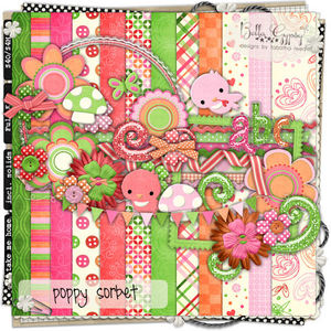
I used this incredibly cute kit by Bella Gyspy Designs called Poppy Sorbet


-----------------------------------------------------------
Janell has been addicted to digital scrapbooking since 2005.  She currently lives in Indiana with her wonderful husband and three children.  A Cherry On Top is thrilled to have Janell on our Creative Team!